
Summary
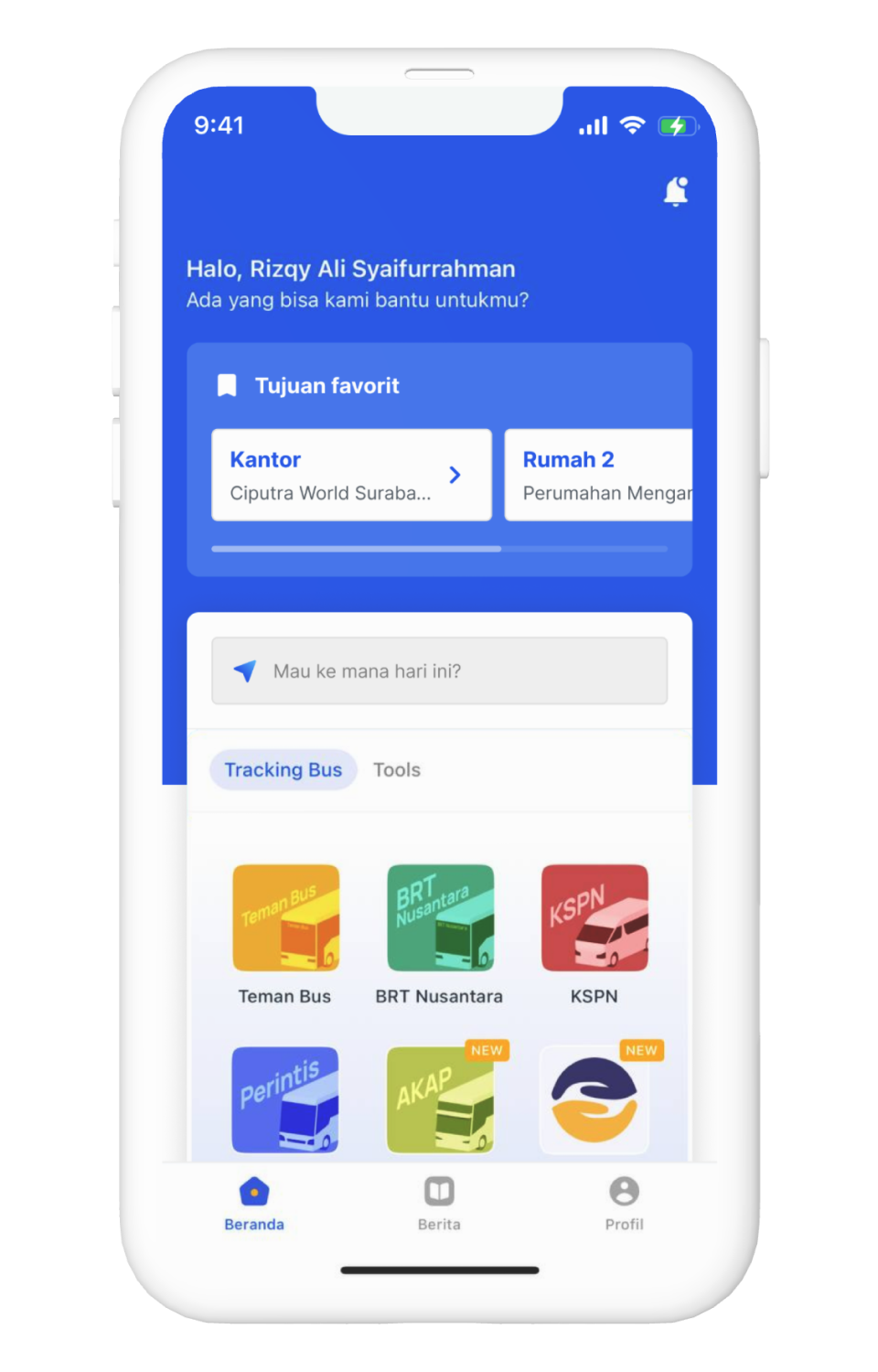
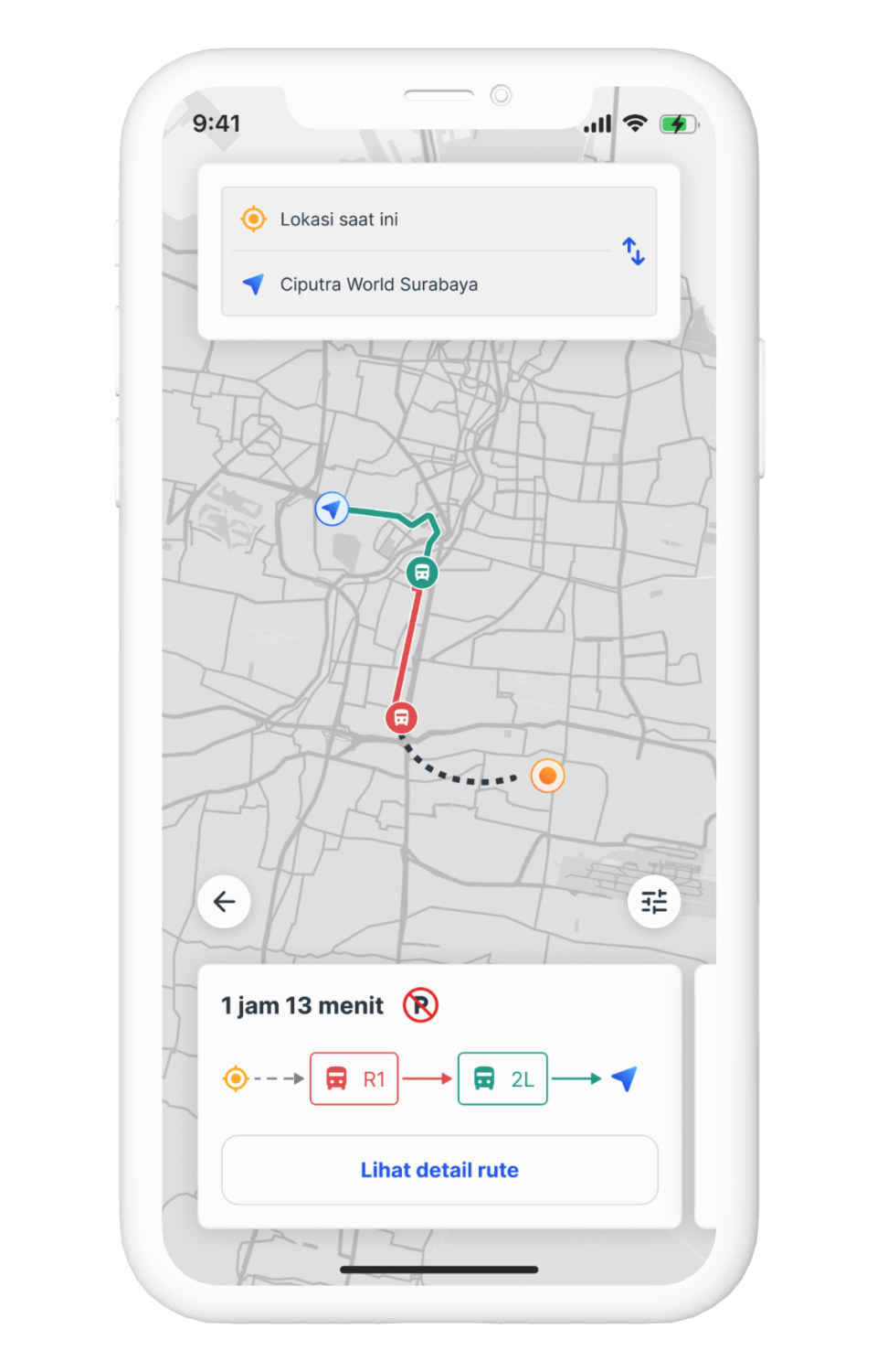
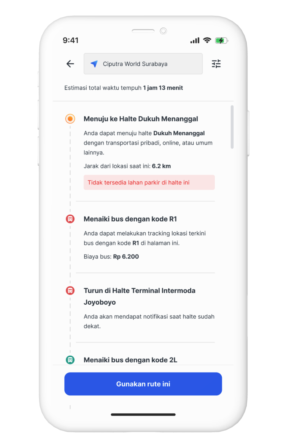
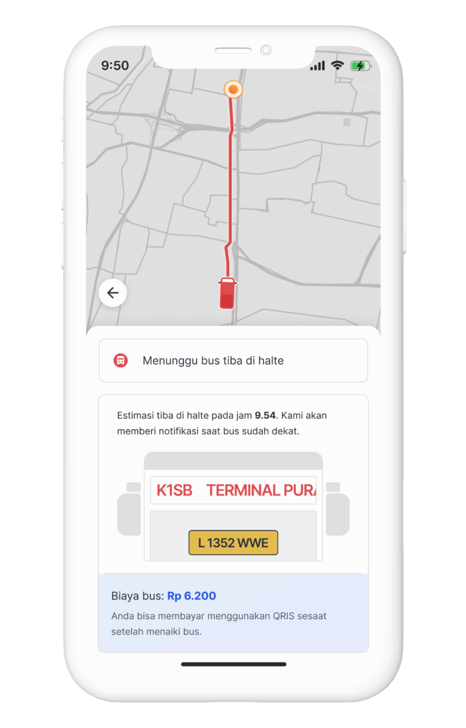
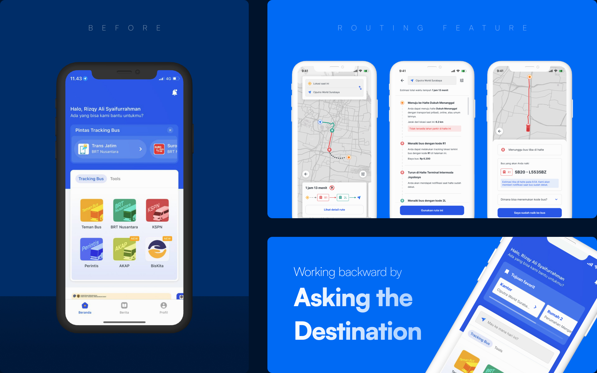
This time I want to talk about Mitra Darat app. So this app is a companion app if we want to go using land transportation type, especially bus.
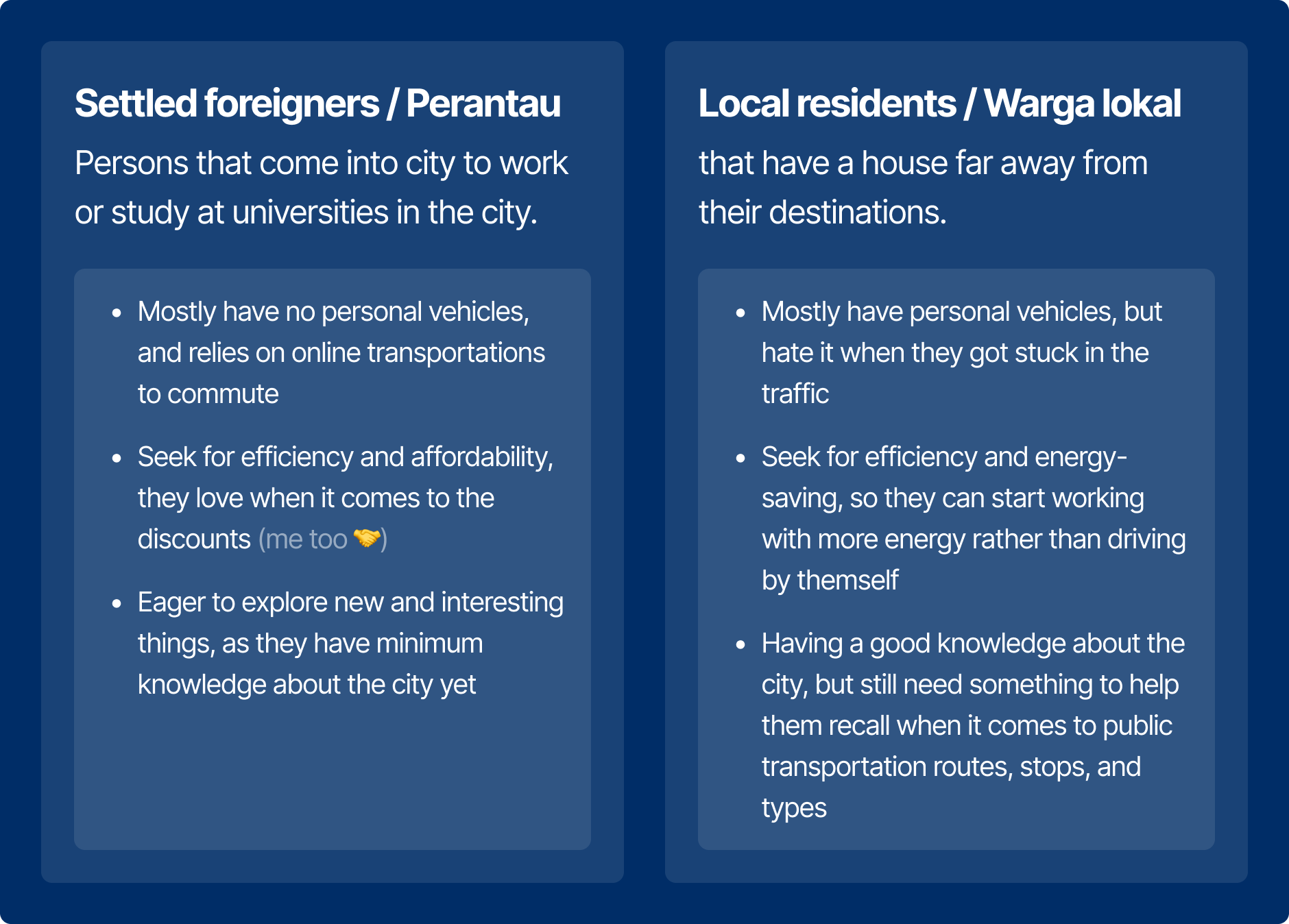
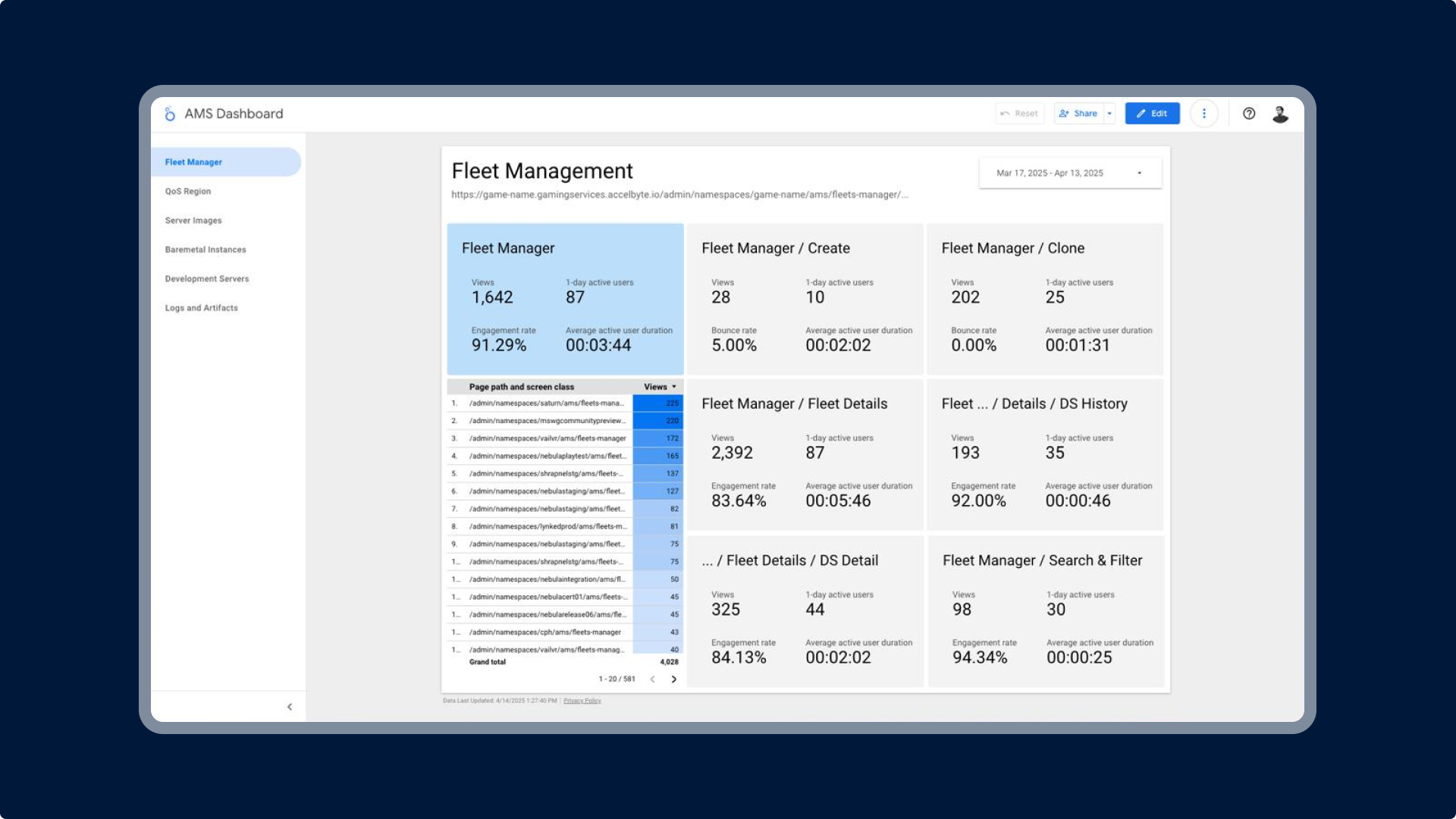
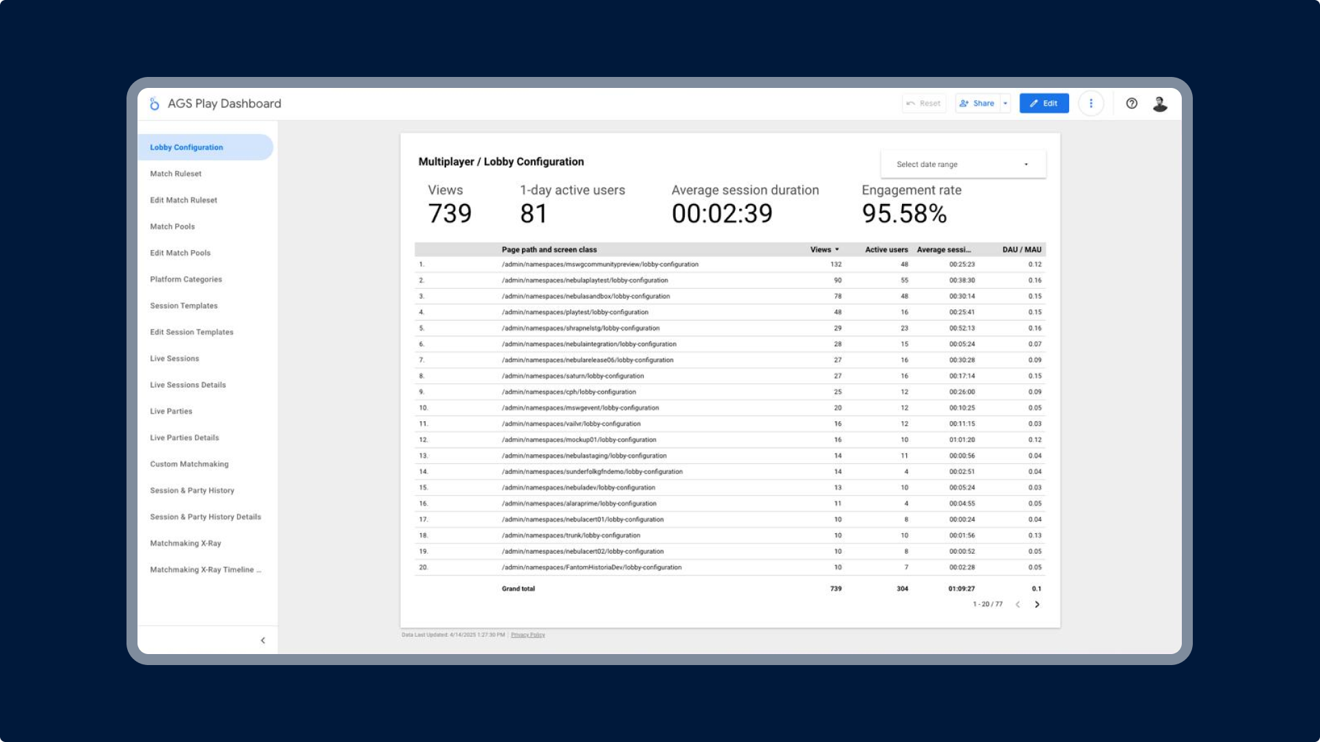
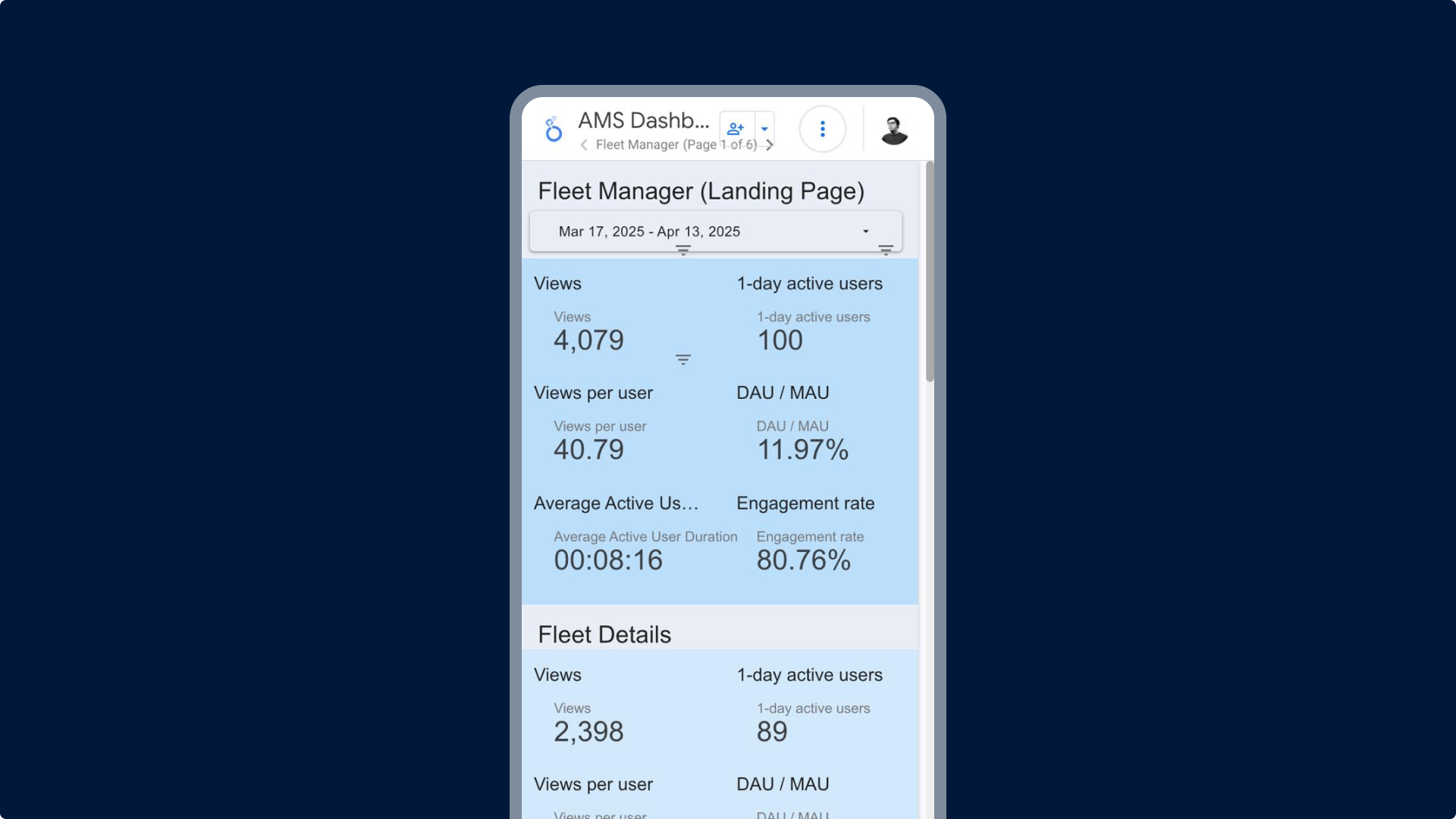
The story started when I wanted to go to watch a movie last week but my motorbike and car was unavailable, but I don't want to use the online transport as it was pricey, so I decided to go using public transport instead. But I find it difficult to define: from where should I start using bus? where should I stop?. And in the end, I just asked the bus conductor, but I think this app can do more than just to live-track the bus.
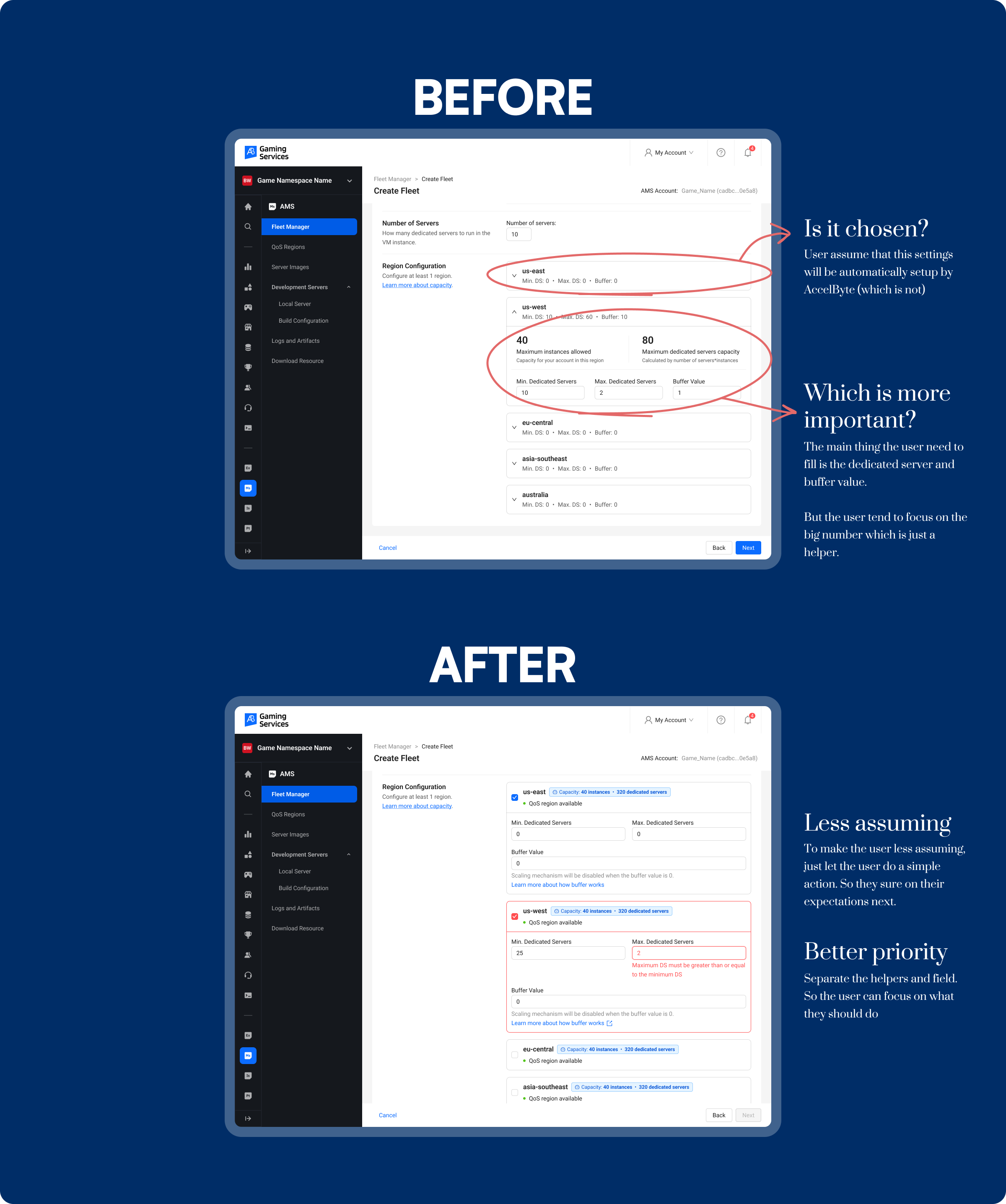
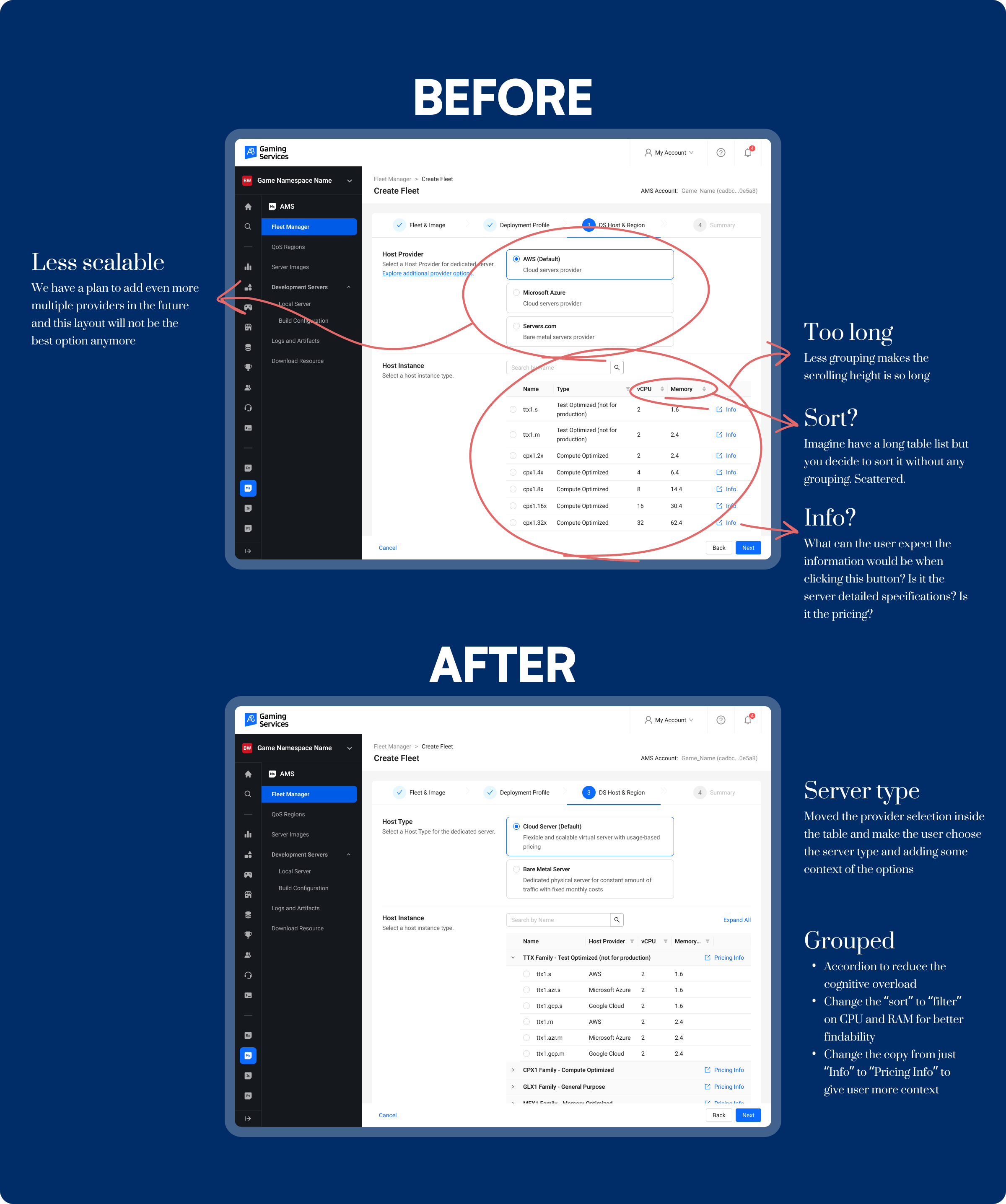
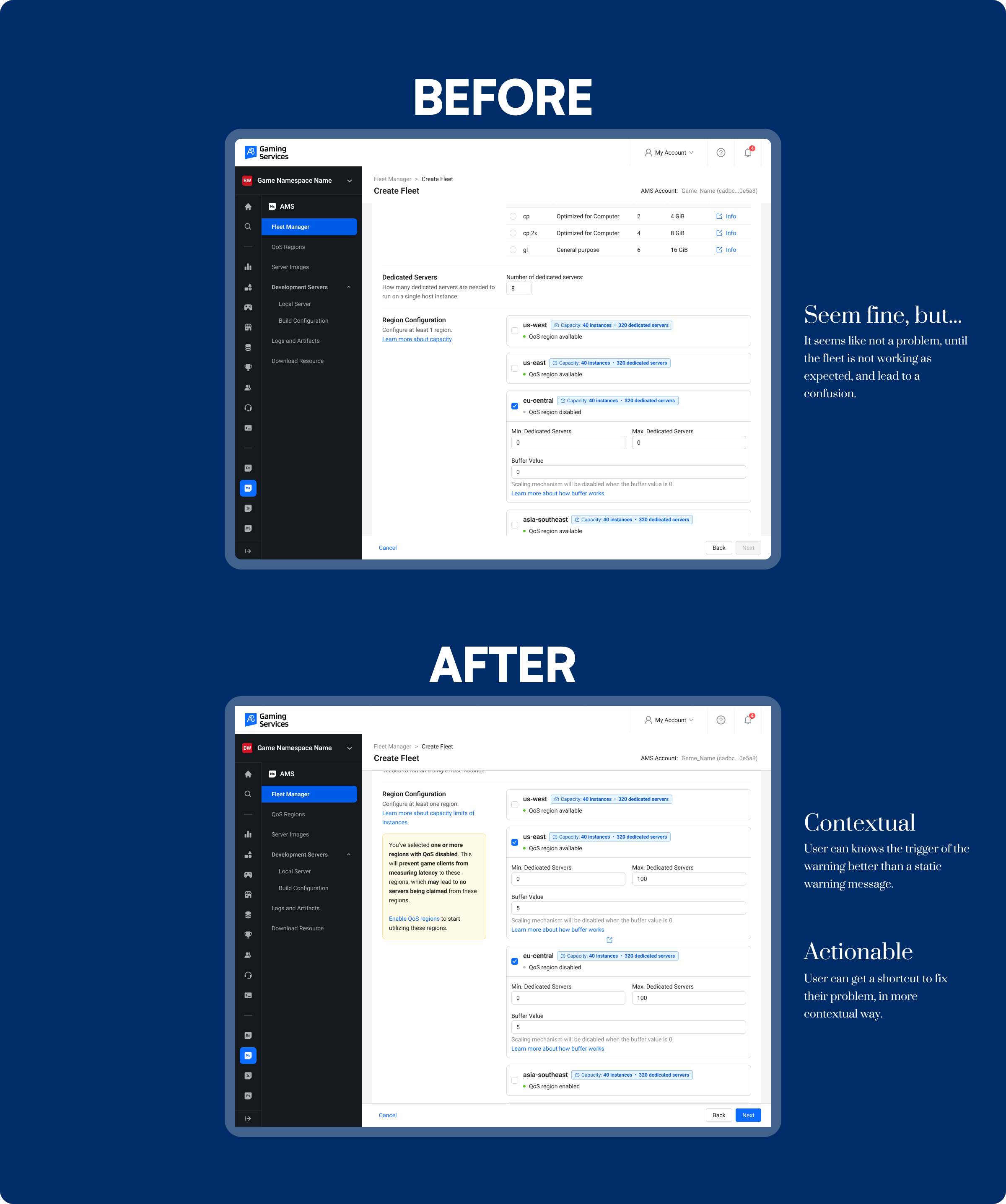
The feature design scope is scope yet untested as I just want to explore on how crazy can I solve this problem. Anyway, I also asked few passengers and observed the others as well, so I can say that some of my insights here is relevant. But this problem is only small compared to the whole service level, so there might be always the more urgent things that must be fixed on the service level and way deeper researches will be needed to evaluate the current surface problems, like the efficiency of the payment of the bus, more proper way to wait at the bus stop, etc.
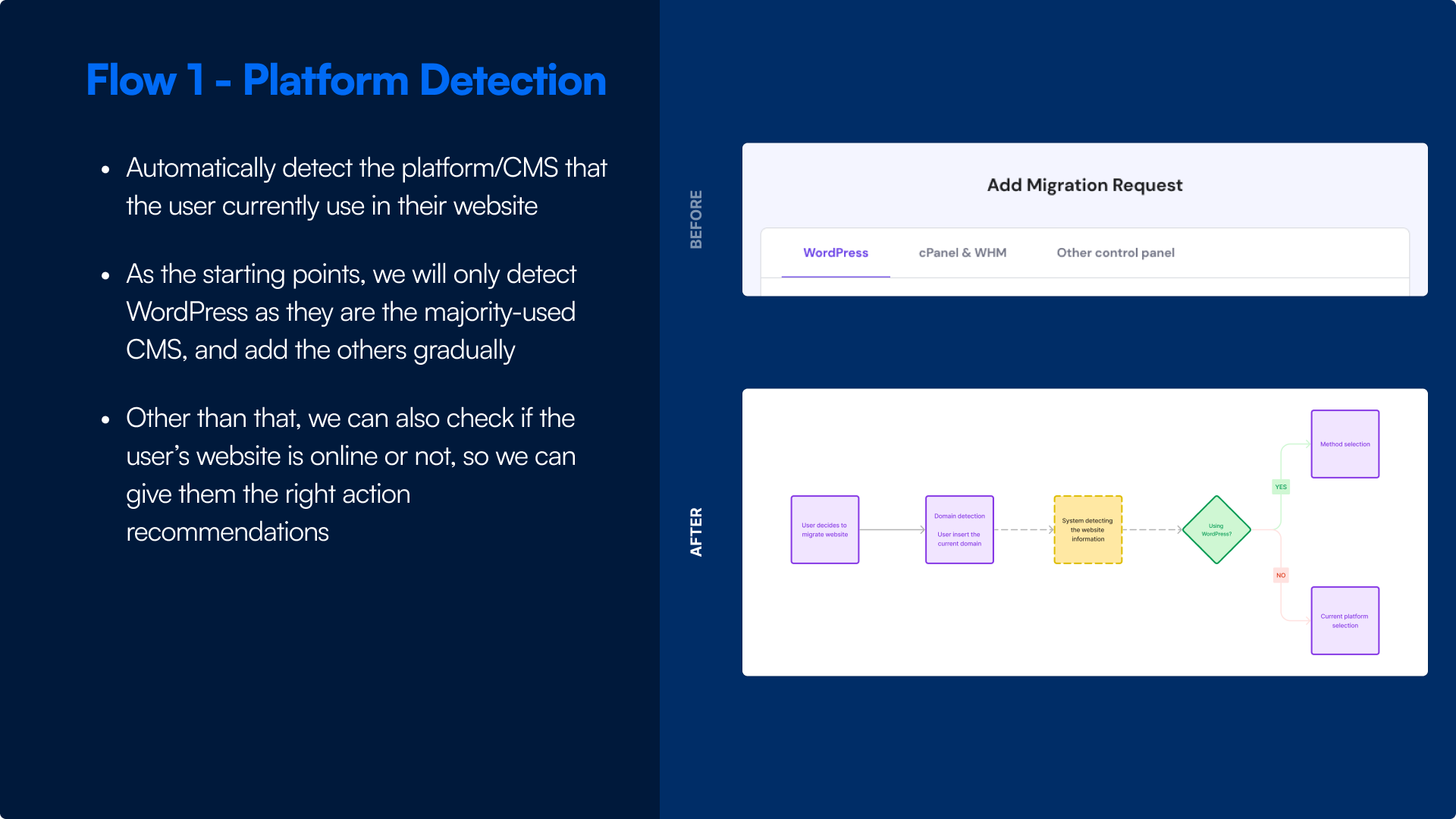
.png)
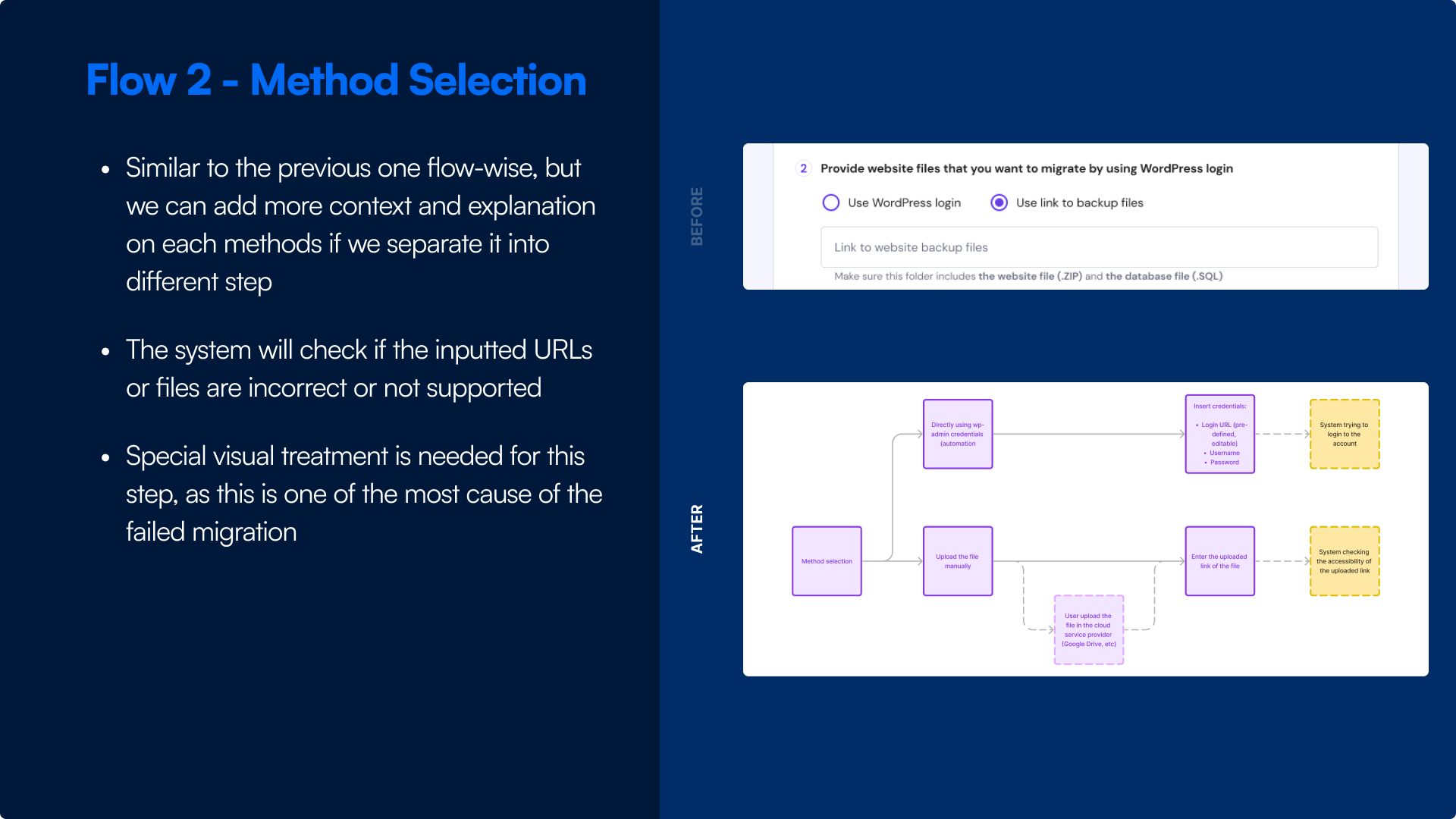
.png)
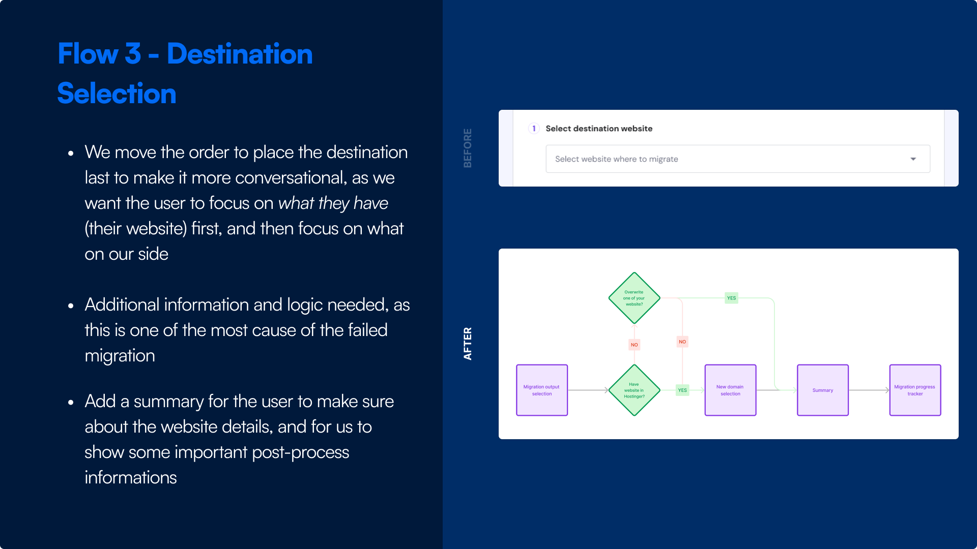
.jpg)
.png)
.png)
.png)
.png)