Building an Analytics Dashboard to Guide Product Strategy
Company
AccelByte
Time span
March 2025
Role
UI/UX Designer III
Product
AccelByte Multiplayer Server
Summary
I initiated a cultural shift in my cross-functional team at AccelByte by introducing a user-centric, data-informed mindset. This helped us move beyond feature requests and toward deeper user understanding—boosting both team productivity and ownership.
Better clarity when choosing and configuring fleet regions AccelByte Multiplayer Server
Before and after improvement
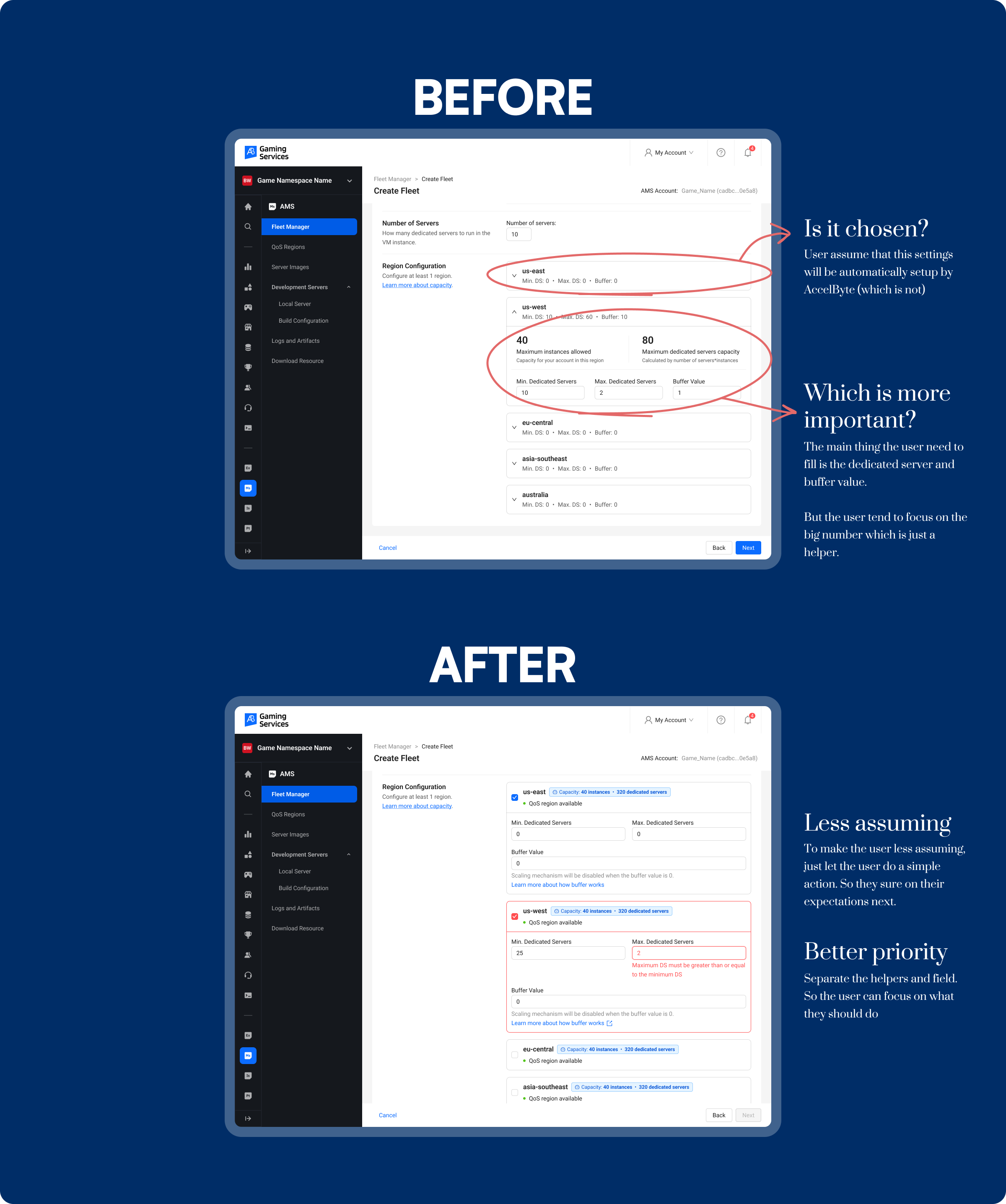
One of the essential steps users need to take when running a multiplayer server is creating a new fleet. A fleet is a system that deploys and connects dedicated servers, allowing players to join a game session. To set up a fleet, users must provide several pieces of information and configure fleet specifications—one of the most important being region capacity.
The Problem
Shortly after I joined the project, we received feedback from users reporting that their fleets couldn’t deploy any dedicated servers. They reached out, unsure of what went wrong. After investigating, we found that the root cause was missing configuration in the region capacity. Users simply left it blank, assuming it would be automatically managed. Unfortunately, this wasn’t an isolated incident—many users faced the same issue.
Key Insights
Our team delved deeper into user feedback and uncovered three main reasons behind this problem:
Assumption of Automation: Game admins believed that the region configuration was automatically handled by the system, so they left it blank.
Confusion with QoS Regions: Game admins mistakenly thought that setting up regions on the QoS Regions page was sufficient. In reality, QoS (Quality of Service) Regions are used to optimize network performance by selecting the most suitable server region based on latency, while region capacity specifically configures the number of instances available per region.
Lack of Guidance: Users weren’t sure what to do in the region capacity section, as the required inputs (like Min. DS, Max. DS, Buffer, and Region Capacity) lacked sufficient explanation. This uncertainty led users to skip the configuration entirely.
The Solutions
To address these issues, we implemented the following improvements:
Interactive Guidance: We added a small action prompt to guide users through selecting and filling in the required information, making the process more visible and approachable.
Contextual QoS Information: We included brief, informative text about QoS status for each region, clarifying its purpose and how it differs from region capacity.
Clear Explanations: We provided contextual information about the key configuration fields (Min. DS, Max. DS, Buffer, and Region Capacity) to eliminate ambiguity and guide users step by step.
These changes significantly reduced confusion and support tickets related to region configuration. Users now better understand how to set region capacity correctly, and the frequent questions about this process have vanished.
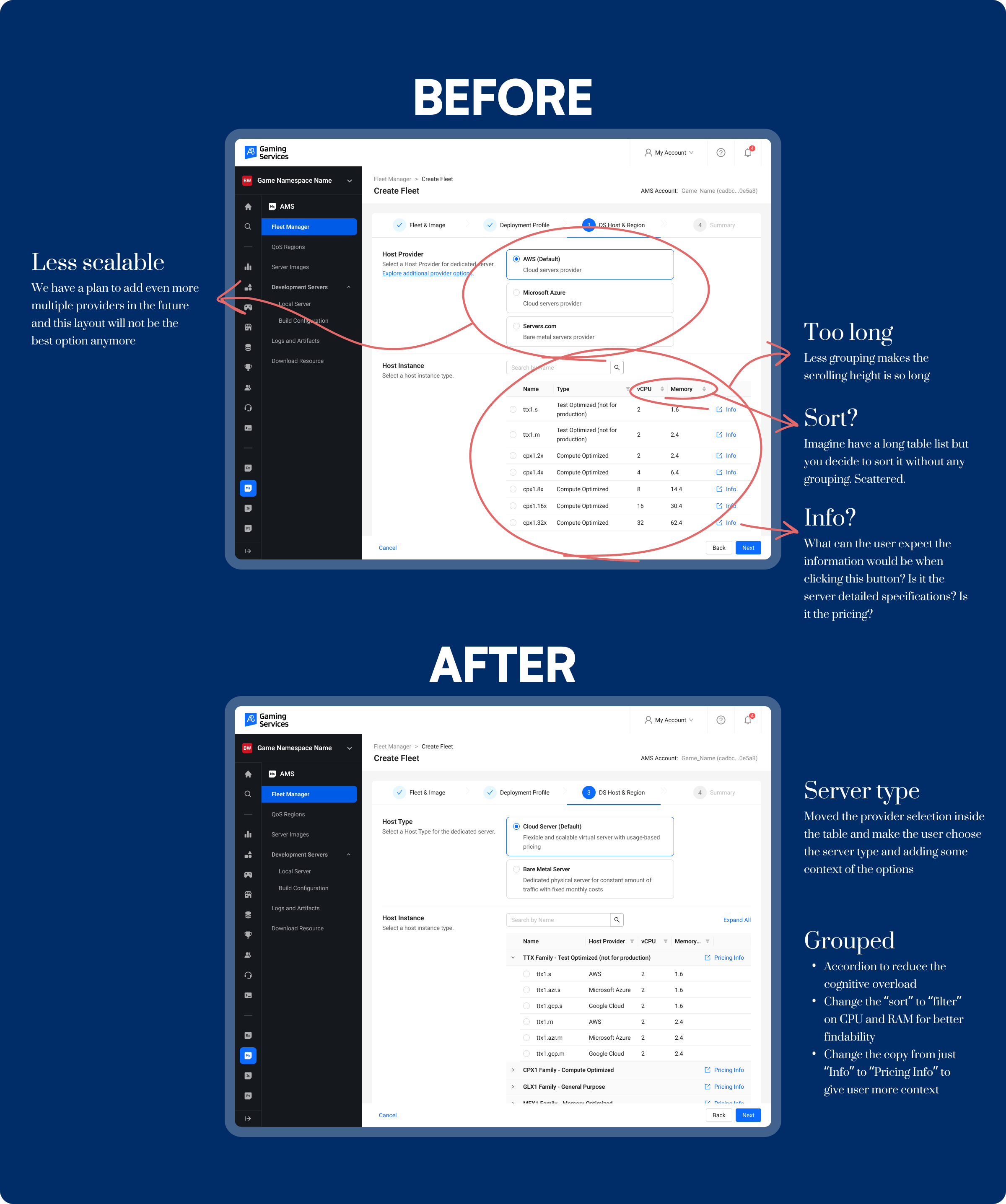
Make instance type selection easier by better grouping and sorting AccelByte Multiplayer Server
Before and after improvement
One of the key steps users need to take when running a multiplayer server is creating a new fleet. A fleet is a system that deploys and connects dedicated servers, allowing players to join a game session. To set up a fleet, users must fill out several details and choose specifications, with one of the most crucial being the instance/server selection.
The Problem
When I first joined the project, I approached it with a fresh perspective, testing the product as a new user. One challenge immediately stood out: selecting the right instance was time-consuming due to an overwhelming number of options. To validate my experience, I gathered user feedback—and it turned out I wasn’t alone. Many users faced the same issue.
Key Takeaways
After discussions and analysis, here are the key takeaways:
Provider Preference: Game admins often have strong preferences for specific host providers. As the company planned to add more providers, it was important to design a scalable solution.
Decision Hierarchy: Game admins typically prioritize RAM size first, followed by CPU Cores, and finally price.
Pricing Confusion: Users frequently asked for instance pricing, even though a link to the pricing document was already provided—indicating the link was either hard to find or unintuitive.
The Solutions
To address the usability challenges and enhance scalability, I made the following changes:
Improved Scalability:
Previously, the instance selection lacked flexibility for future expansions, especially when adding new host providers.
I restructured the layout to accommodate multiple providers, ensuring it would remain efficient as new options are introduced.
Server Type Categorization:
Instead of listing providers directly in the dropdown, I grouped them by server type, making it more intuitive for users to select the appropriate option.
This approach minimizes cognitive load by clearly indicating whether the server is optimized for production, general use, or other specific functions.
Better Organization through Grouping:
The original long, unstructured list made it hard to scan and select instances.
I introduced an accordion-style grouping based on instance family (e.g., CPU, GPU, General Purpose), allowing users to expand only the relevant category.
Changed the interaction from sort to filter based on CPU and RAM to improve findability.
Clearer Information Labels:
The ambiguous Info label led to confusion about what the button would display.
I replaced it with “Pricing Info” to set clear expectations and reduce uncertainty.
As a result, the confusion around instance selection significantly decreased, and the streamlined process is still in use today.
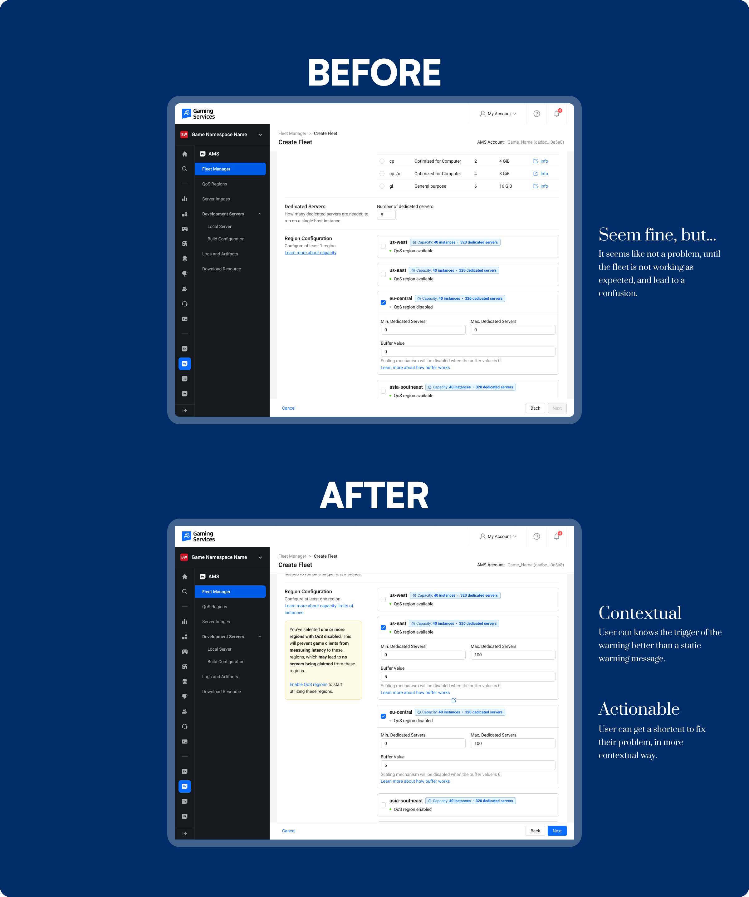
Improve QoS region's information clarity on region configuration AccelByte Multiplayer Server
Before and After Improvement
In AccelByte’s Multiplayer Server, there are two types of region entities that serve different yet related purposes:
Fleet Region DS Configuration: Defines the number of Dedicated Servers (DS) available in each region. It sets the capacity for game sessions by specifying Min. DS, Max. DS, and Buffer, based on the Region Capacity.
QoS Region: Determines the Quality of Service by selecting regions with the lowest latency for players. It ensures that game sessions are hosted on the most optimal server location.
The Problem
We encountered cases where users had correctly configured the Dedicated Server and Buffer amount for a specific region, but the fleet still failed to claim a server in that region. After a thorough investigation, including analyzing analytics data, we discovered the root cause:
Some users did not activate any QoS region during the setup process.
A significant number of users never even visited the QoS page while configuring their fleets.
This confusion arose because users didn’t fully understand the relationship between Fleet Region Configuration and QoS Region—assuming that setting up the DS configuration alone was sufficient.
The Solution
To address this issue quickly and effectively, we implemented the following improvement:
Dynamic Alert: When users select and fill the Dedicated Server and Buffer amount for a region that has no active QoS, a dynamic alert now appears, informing them that the QoS region must be activated for the configuration to work.
This quick-win solution not only prevents fleet deployment failures but also educates users on the importance of enabling QoS regions—even if they are already familiar with the technical terms.
With this small but strategic update, users now receive real-time feedback during setup, significantly reducing configuration errors. This proactive alert serves as a subtle educational touchpoint, helping even advanced users avoid common pitfalls.
Project Background
At AccelByte, I joined the AMS team during a pivotal transition. While our B2B setup naturally oriented us toward client feature requests, the company’s 2025 strategy began shifting toward indie game studios and free-trial experiences. This change called for a more proactive, user-centric product mindset.
Migration issue has the most tickets from customer success team
Only ~20% from the total visitors are successfully submitted
From the successfully submitted requests, less than half of them are successfully migrated
Discovery
The problems that we discovered are still wide, so we need some further and deeper research to get into the core problems and what disrupt the users from achieving their goals.. For this case, I used these methods:
From those researches, we get these key themes and insights:
And that trigger something in my mind,
How might we increase visibility into user behavior to make more informed product decisions, even with limited direct user contact?
Constraints and challenges
Here are the product departments' challenges related to this project:
Limited Access to User Data
Most team members couldn’t access user behavior insights beyond basic or disorganized Google Analytics data, making it difficult to understand how the product was actually being used.
No Standardized Analytics Tool
There was no unified or easy-to-use tool for tracking and sharing behavioral data across the team, creating a disconnect between user activity and product decisions.
Reactive Product Culture
As a B2B product team, we were accustomed to building based on client requests rather than proactively identifying user needs, which limited our potential for innovation.
Time and Resource Constraints
With ongoing development work and tight sprint cycles, creating new systems or tools from scratch was not feasible, especially without support from a dedicated research team.
Main concept
From the mentioned constraints, me and the team converge the rough ideas into the main concept, we can quickly get the idea and refer to this main concept.
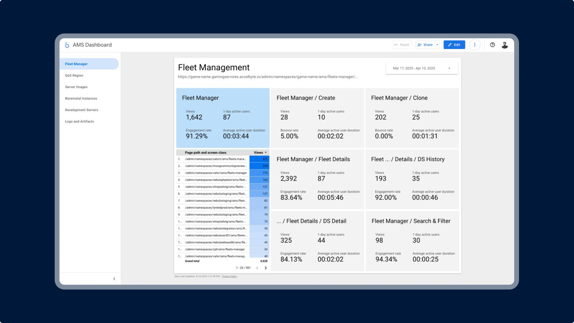
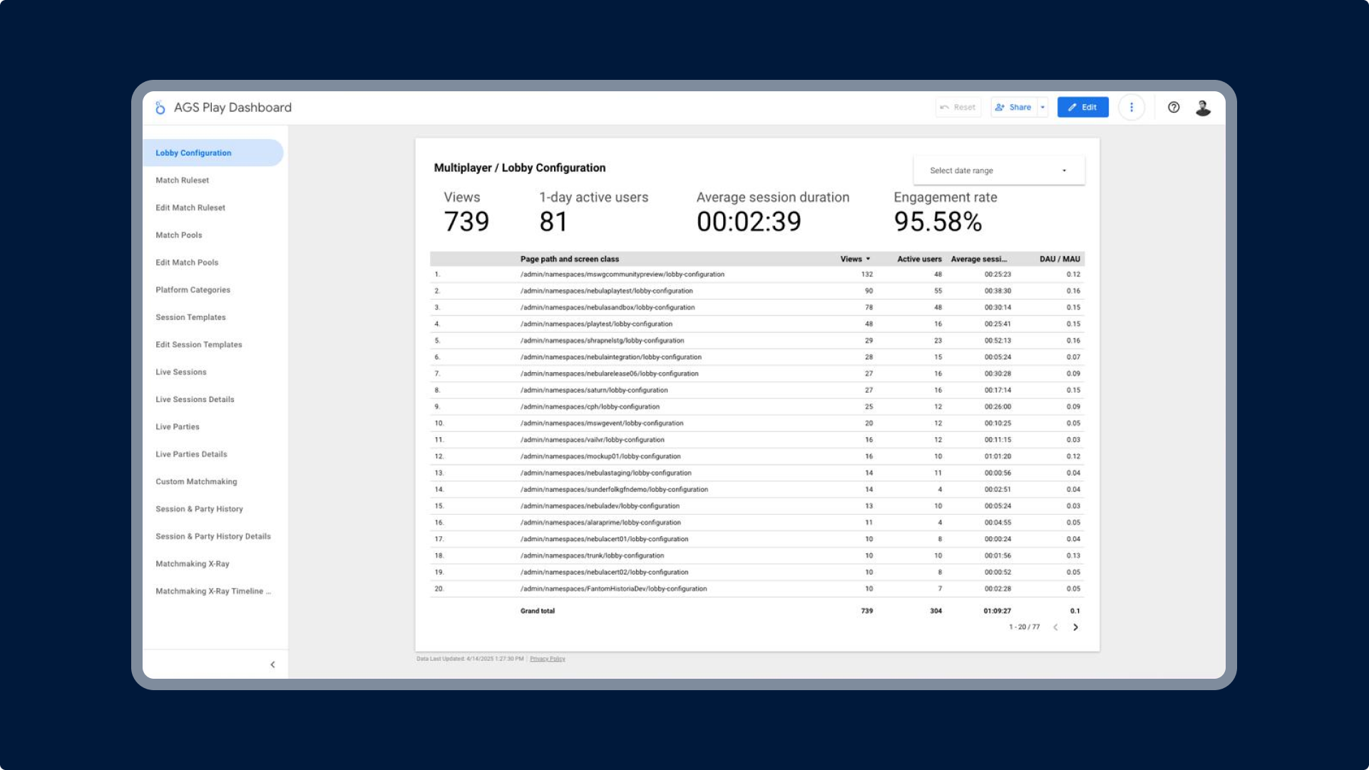
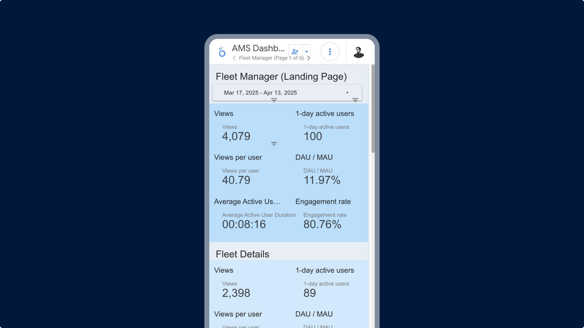
Building a Behavior Dashboard
I created an analytics dashboard using Looker Studio, consolidating fragmented data sources into a clear, actionable visualization. This tool made user behavior more visible to the entire cross-functional team
Inspiring a Data-Driven Culture
By sharing the dashboard in design and product syncs, I encouraged a more proactive mindset. This not only boosted ticket completion rates during sprints but also inspired other product teams to explore similar initiatives.
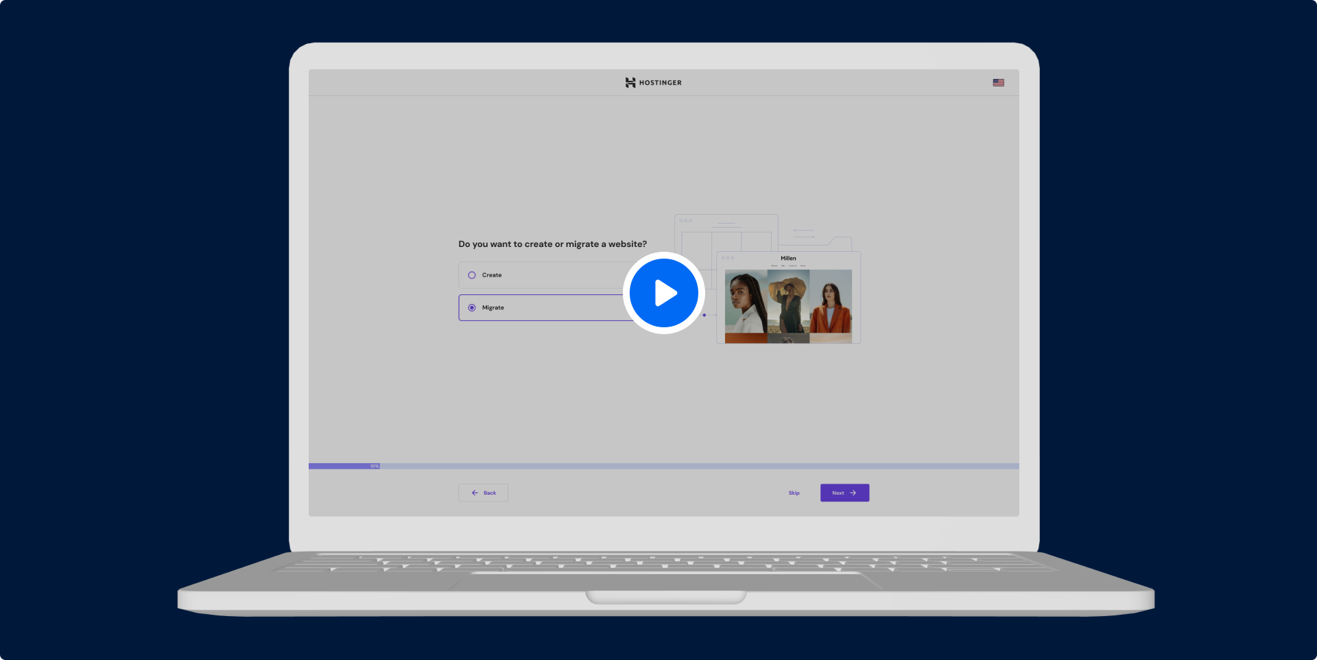
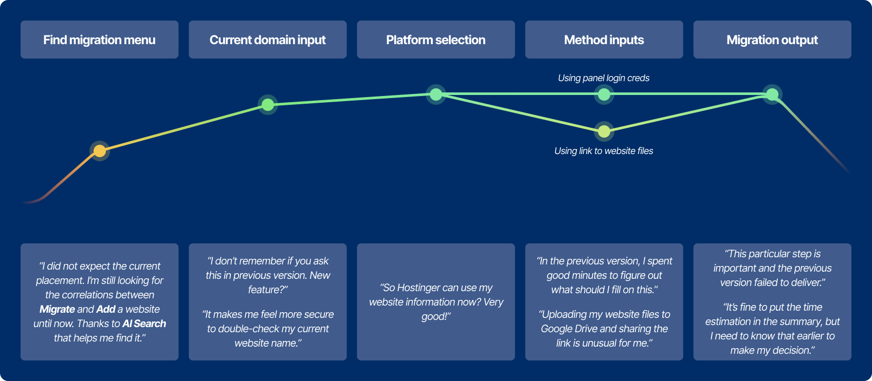
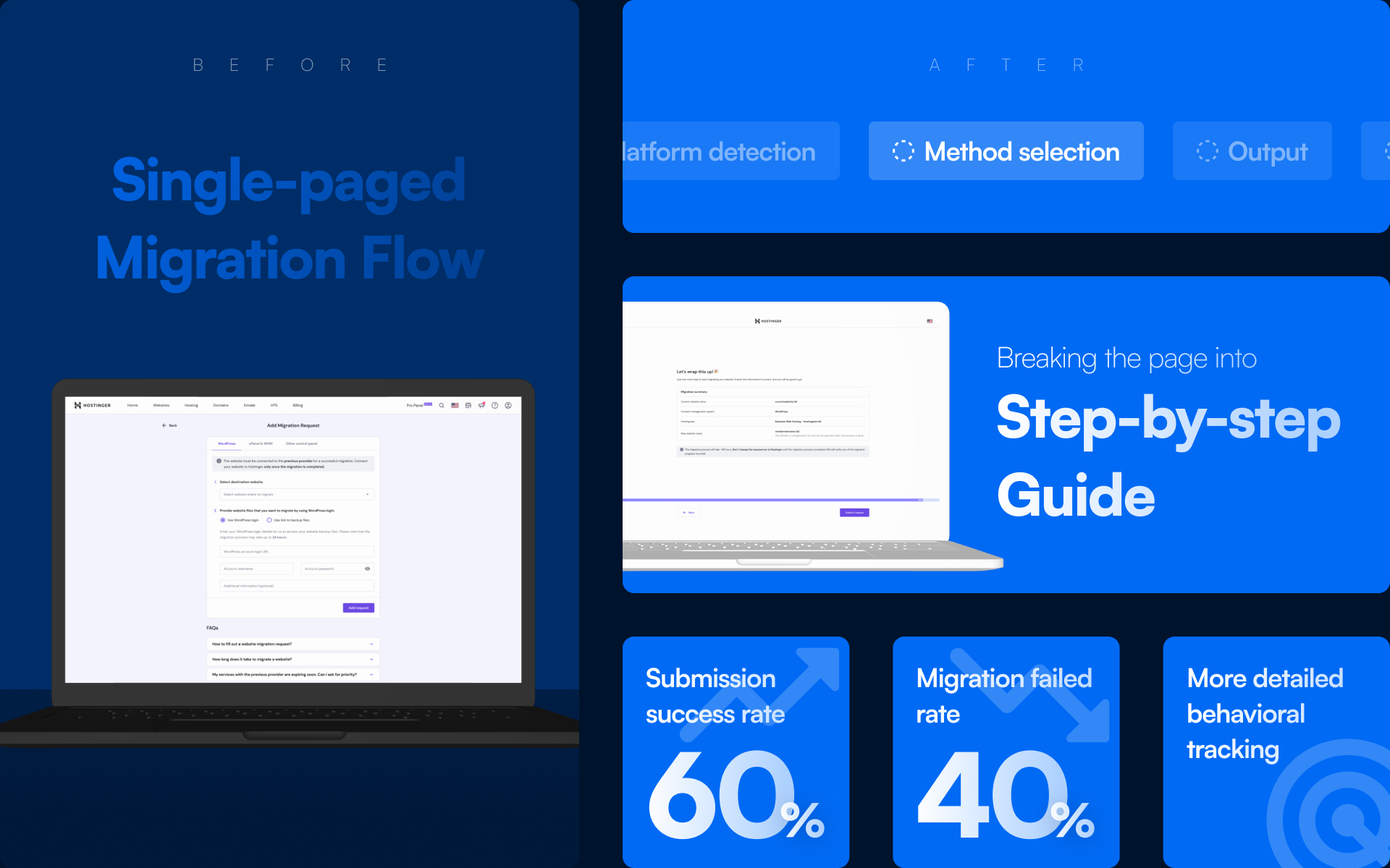
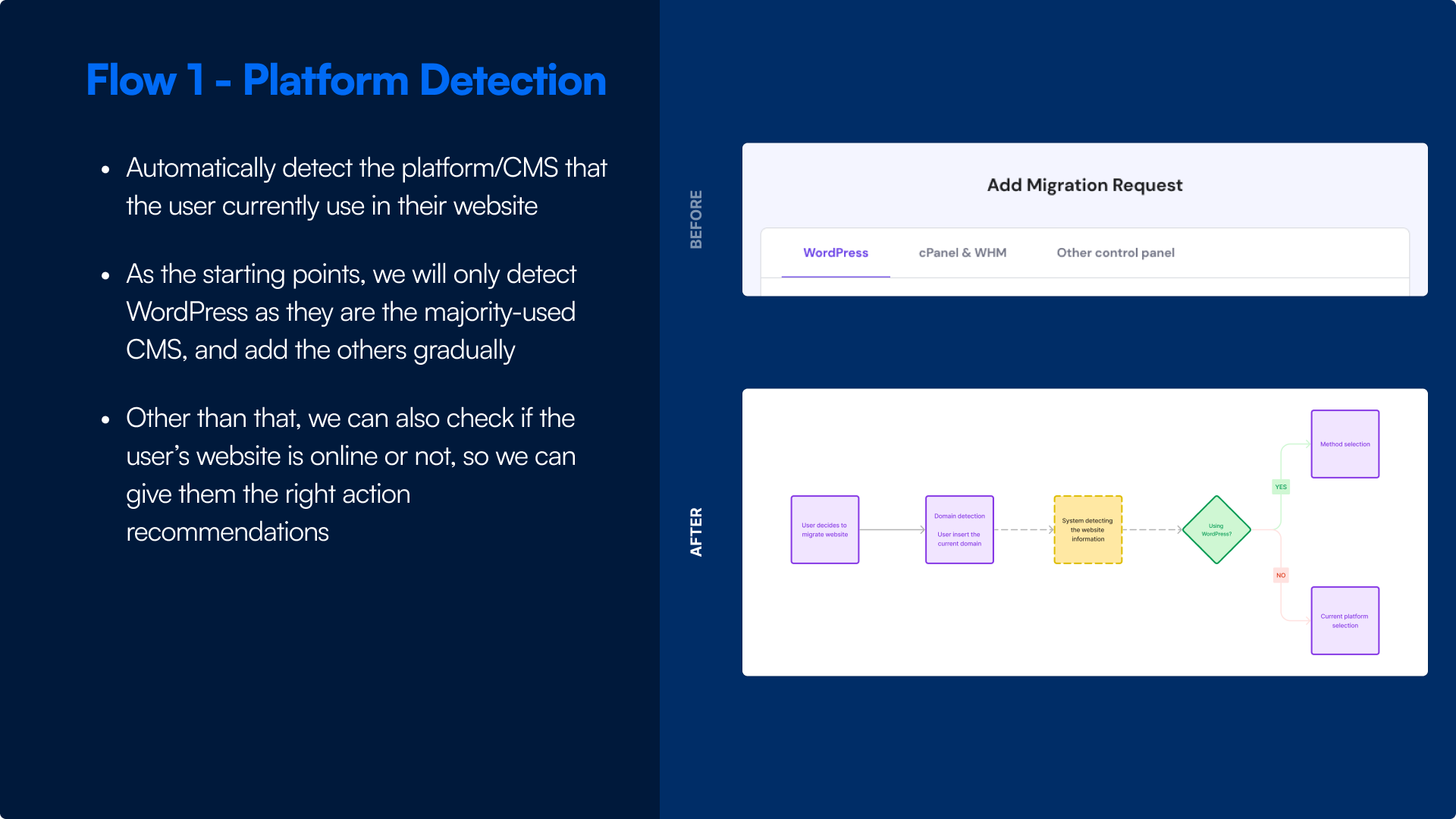
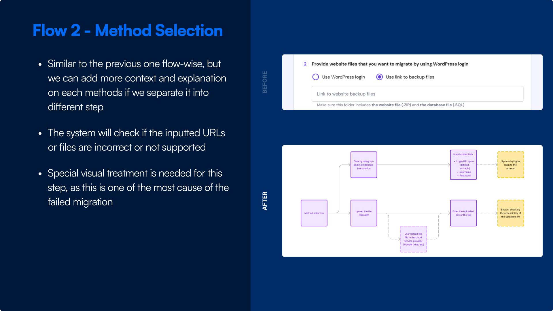
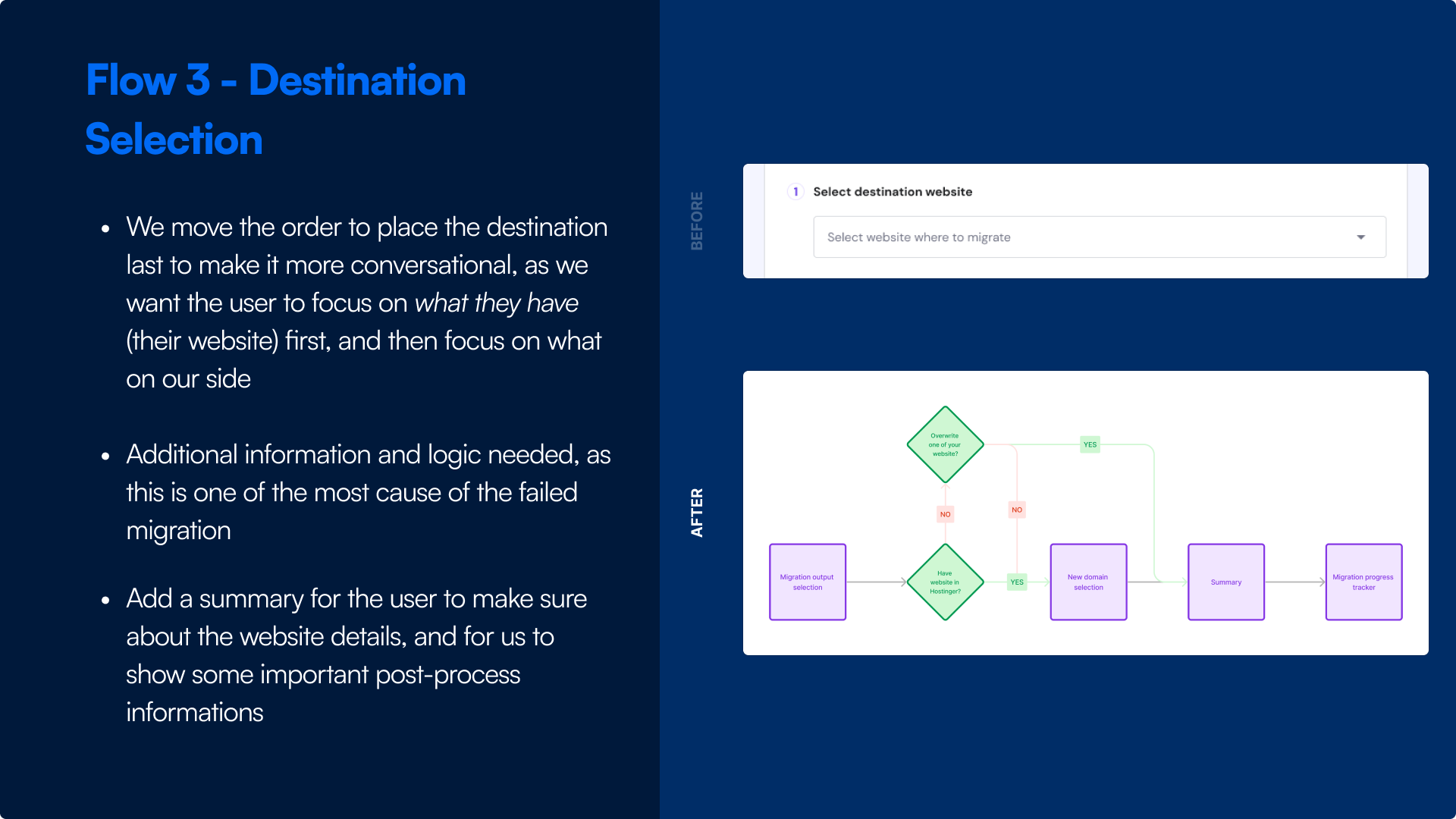
From previous main concept, we decided to break the page into several key steps: Platform Detection, Method Selection, and Destination. We also add a summary to let the user double-check and validate their website information before requesting.
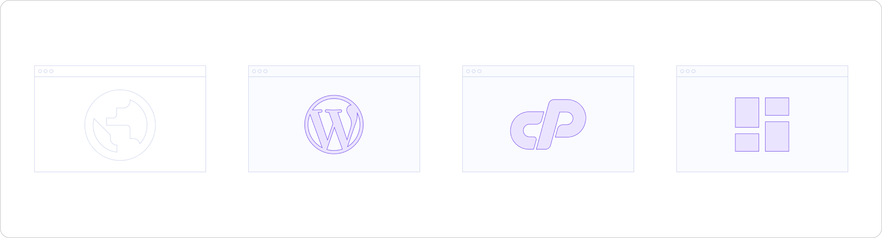
Illustration for indicating something simple and not needing any more explanations, like platform logos.
Instructional image
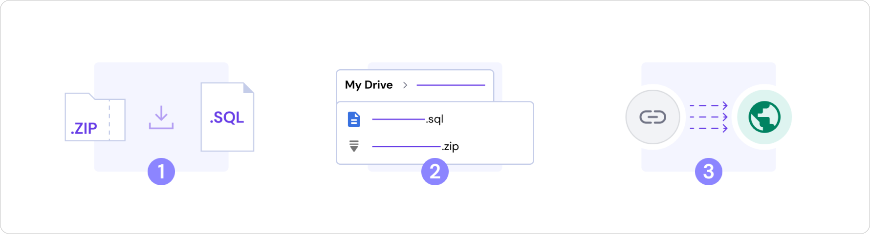
Illustration for giving the user guidance for something that they think is hard to do or needing more context, like uploading a file, because there are a lot of steps that they need to do.
Action selection image
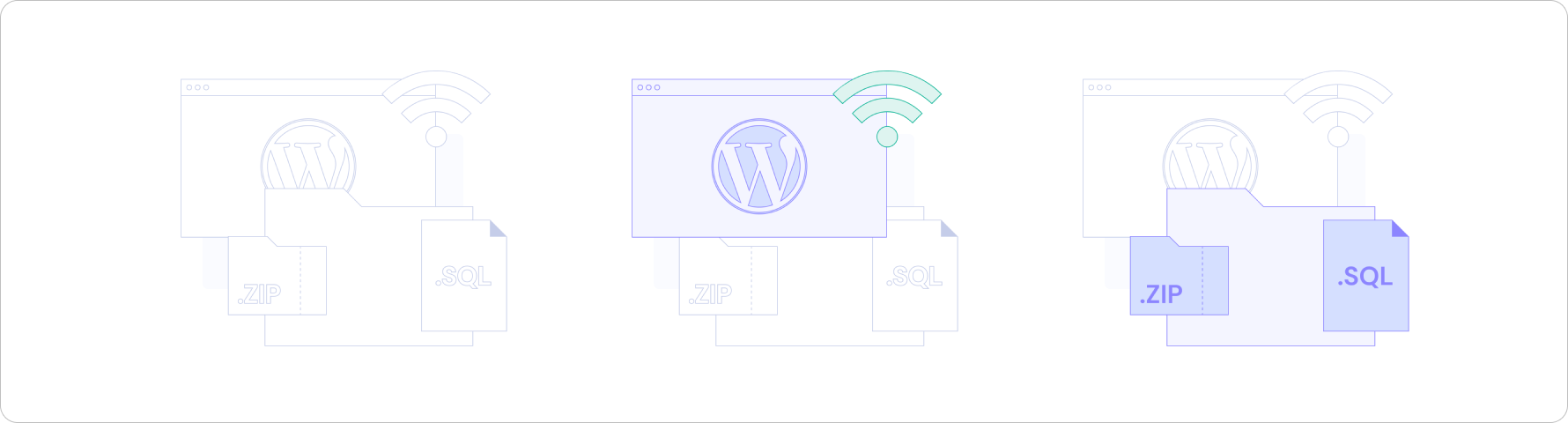
Illustration for indicating an actions that they will do, so the users can foresee what they will do next, like in methods selection.
Conditional image
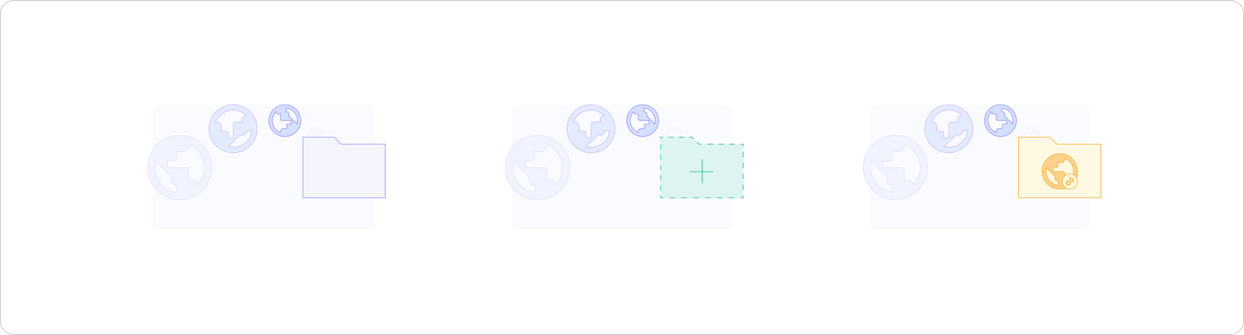
Illustration for indicating the conditions that will happening after choosing several questions, like when the users choosing the output destinations of their website.
Here is the final result of the project. This one is the base iteration that the team will explore more and evaluate. So there will be a lot to be evaluate and iterate in the future.
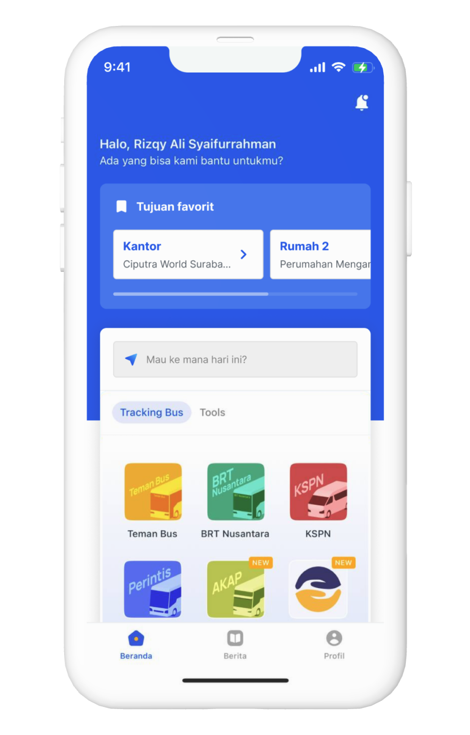
Here is the design of the key pages of the feature. These pages are the one that can solve the passengers' problem regarding to the navigation.
Disclaimer: I concepted this without any detailed technical specs, and only based on my own assumptions and experiences on designing an online transport apps.
Additional form to input destination
As I state before, I want to ask the goal, which is the destination, upfront. And the right placement of this input is inside the main bus service selection section that takes a lot of attention.
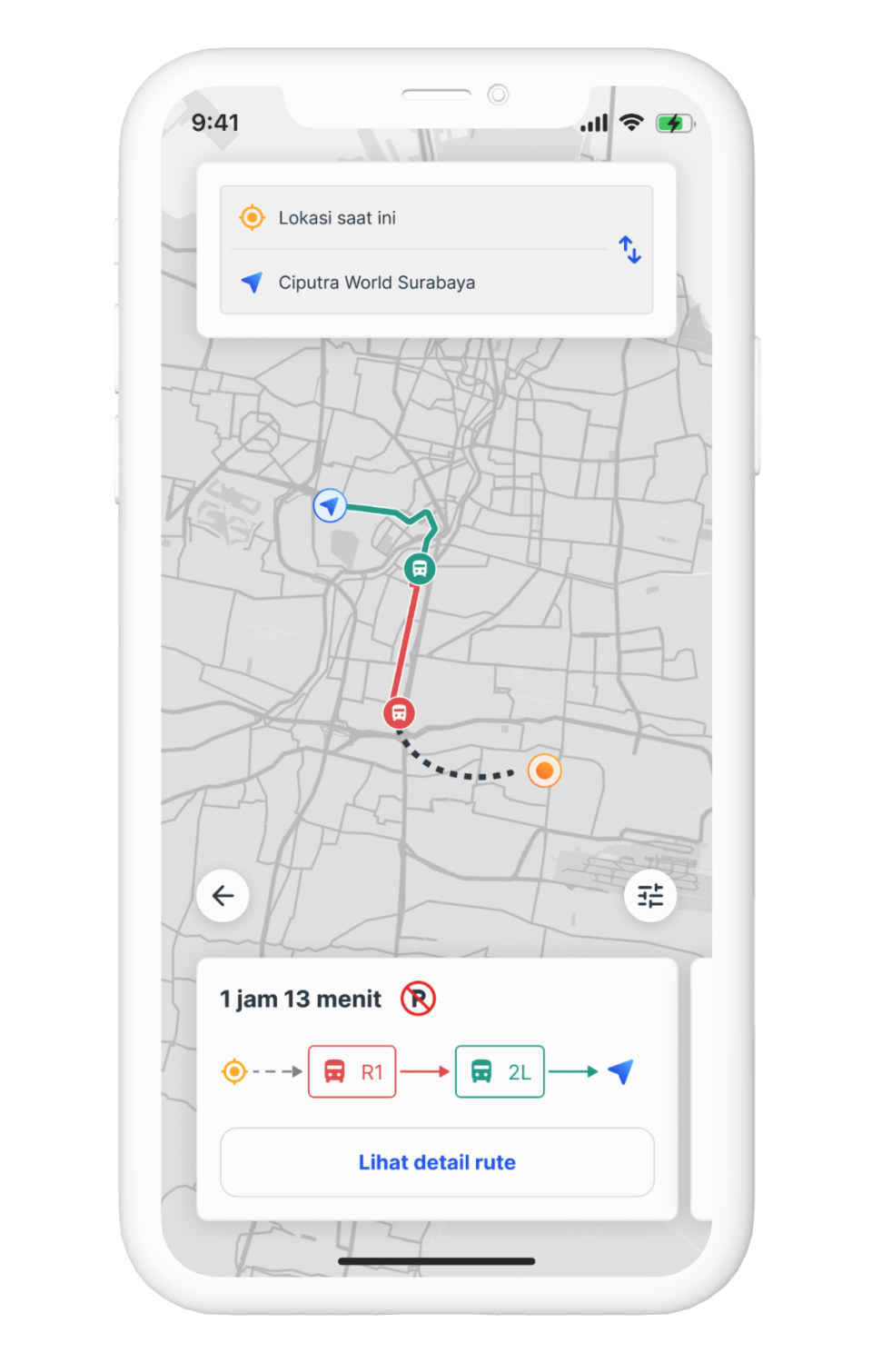
Route selection screen
In this screen, I want to give the user a summary of the main information that the passengers need when using a bus service. Here I show the route summary (in map), estimated time, and bus type that they will use.
I also add the parking availability. So the passenger that using their own vehicle can expect where to park their vehicle.
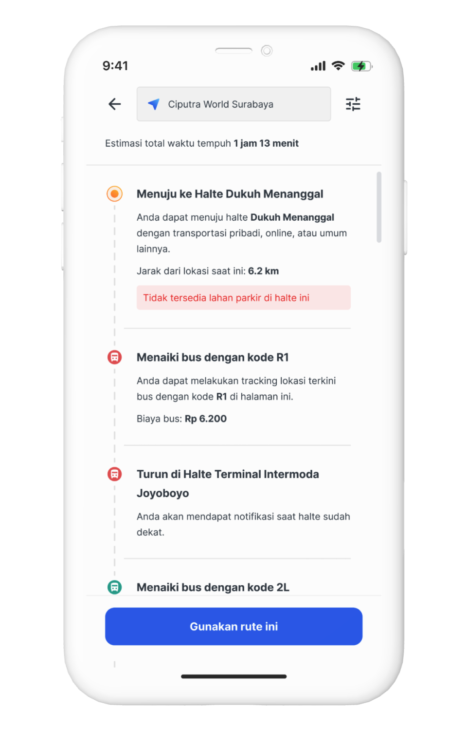
Route details screen
This will be the details of the route summary. Passengers will see the details like the starting bus stop including the distance from their current position, bus type that they will use including the price, where to switch the bus type if needed, and the final bus stop near the destination.
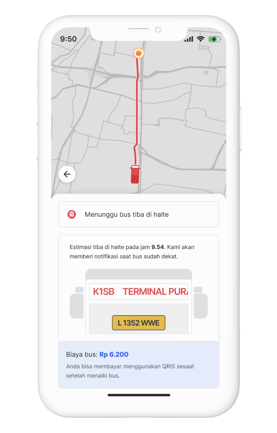
Roaming screen
This will be the screen after the passenger hit Use This Route button from previous screen. There will be various states of this screen depend on what state the passenger into.
For example in this screen, is the state when the passenger is waiting in the bus stop. In this case, I show the live location of the bus (yes, the bus already have a GPS tracker), the price, vehicle license number for easier identification, and the bus code that reflect how the bus code shown in real life (most important).
The states will automatically switched after reaching certain checkpoints for easier interaction. Just like in mainstream ride hailing platforms.
As the development goes because of the tight timeline, I tried to evaluate the approach to the users so we can mitigate the worst part better and to define what to do next faster so we can deliver it faster as well.
For the impact, I don't really know how to put it into numbers, but the introduction of the analytics dashboard had a ripple effect across the AMS team and beyond. Such as:
Improved Visibility into User Behavior
The dashboard made user interaction data accessible and understandable across the team
Boost in Sprint Productivity
We saw an increase in completed tickets per sprint, indicating better focus and execution.
Stronger Product Ownership
Team members felt more connected to the product by understanding how it's actually used.
Mindset Shift to Proactive Thinking
The team moved from reacting to client requests to proactively identifying user needs.
As Figma has a new policy regarding to their sharing policy, I can't give any access to try this interactive prototype. But, to demonstrate how the final design solution, I attached the video recording of the prototype.
As this project is only just-for-fun, I didn't really do any testing for this design.
Interested to talk further?
Feel free to getting in touch with me by hitting the button right there


.jpg)
.png)
.png)
.png)